Hiring the right talent is crucial, but analyzing recruitment data shouldn't be a headache. As talent acquisition standards get more dynamic, a recruitment dashboard with the right metrics can keep your hiring data-driven and effective.
A customizable recruitment dashboard template lets you:
- Evaluate your hiring funnel
- Detect the root cause behind bad hires and candidate churn
- Quantify your hiring strategy’s effectiveness
- Make data-driven improvements
- Identify the delays by stages
But what exactly is a recruitment dashboard, and what should it include? Let’s find out.
What is a recruitment dashboard?
A recruitment dashboard is a business intelligence tool that visualizes the performance of your recruitment process through KPIs, metrics, and reports. You get real-time insights into applicant data, budget, hires, vacancies, campaigns, phases in the recruitment funnel, etc.
Therefore, it keeps your internal recruitment processes organized and data-driven. With every key data point laid out clearly, recruiting managers can ensure a balanced recruitment process focusing on a unified goal.
Why you need a recruitment dashboard
Here are some top reasons why you should leverage a recruitment dashboard:
1. Analyze your hiring funnel
From awareness to onboarding, a hiring funnel has multiple pieces at play. As your recruitment needs scale, monitoring them individually becomes increasingly difficult.
Solution? A recruitment dashboard template.
A recruitment template highlights your hiring funnel through visuals and numbers. It displays how many applicants move from one stage to the next and uncovers improvement areas in each step. You can identify which sources drive the best candidates to your funnel and focus there.
2. Identify the bottlenecks
If your recruiters aren’t tech-savvy, they may struggle with identifying bottlenecks in your hiring funnel when analyzing individual KPIs. But with a high-level recruitment dashboard, you can see the patterns and trends in your recruitment data through real-time reports and pinpoint the issues at each stage.
3. Tweak and improve your hiring strategy
Besides simplifying funnel assessment data, a recruiting metrics dashboard template offers actionable insights. Once you identify the problems, you can tweak your hiring strategy accordingly to get results.
For example, if there’s a significant drop-off in the interview stage, you can understand the root cause. Is it your lengthy interview process? Is it the vague next steps? Study the recruitment data to identify issues and improve candidate experience.
Metrics to include in a recruitment dashboard template
HR recruitment dashboard templates keep everything organized and data-driven. However, the success of your outbound recruiting depends on the metrics it tracks.
So, what KPIs should you add to your recruiting dashboard template? Let’s discuss:
1. Time-to-fill
It refers to the time it takes to source and hire a new candidate. Companies often measure it by the days between the job posting and the candidate accepting the offer.
Since hiring candidates can be time-consuming, companies look for ways to reduce time-to-fill considerably while ensuring the hiring quality. A recruitment dashboard template keeps you updated on this metric and serves as a warning when your hiring process takes too long.
2. Cost-per-hire
This measures the total expense of bringing a new employee to the company. It includes these costs for:
- Candidate sourcing
- Screening and interviews
- Equipment
- Travel and administrative
- Referral bonus program
The formula to calculate cost-per-hire goes like this:
CPH= Internal + external recruiting costs/ total number of hires
3. Quality of hire
Quality of hire quantifies the total value a candidate brings to the company. It indicates whether a person you hired can carry out their responsibilities optimally.
This KPI measures how much a hire contributes to your company’s long-term success through task completion and constant skill improvements. QoH is a subjective metric you can track months after hiring a candidate.
To quantify it, you can decide the indicators in percent and get the mean, i.e.,
QoH= (indicator 1 % + …. + indicator N %) / N
4. Applicant satisfaction rate
Applicant satisfaction rate (or talent satisfaction rate) measures your candidates’ perception of your company’s recruitment experience. It covers their satisfaction right from finding the job posting to their onboarding.
A recruitment dashboard template with an applicant satisfaction rate can be pivotal to understanding how smooth your recruitment experience is and can eliminate bumps that could cause a candidate to drop out of the funnel.
5. Offer acceptance rate
An OAR measures how many candidates accept a formal job offer from your company and offers insights into the efficacy of your talent acquisition strategy.
Keeping track of the offer acceptance rate measures your company’s ability to attract the best talents. A consistently high OAR in your recruitment dashboard template indicates your hiring strategies are flexible and transparent enough to accommodate the candidates’ expectations.
If your OAR is lower than industry benchmarks, compare it with the other recruitment patterns in your dashboard to track the root cause. Eliminating these problems creates a more cohesive recruitment strategy and a positive employer brand.
6. Interview-to-hire ratio
The interview-to-hire ratio compares the number of interviews conducted with the number of candidates hired in a specific recruitment cycle. This shows how well your recruitment strategies are working to convert applicants into employees.
Having this KPI in your HR recruitment dashboard template also indicates the quality of your screening process. A high interview-to-hire ratio, subjected to a high quality of hire, shows your candidate matching methods are rigorous.
However, lower numbers indicate you need to work on attracting suitable candidates.
7. Source of hire
Source of hire uncovers the job boards and channels most effective in driving the best candidates to your recruitment funnel.
Most recruiting managers use multiple channels for passive candidate sourcing. But not all will get you eligible applicants. To let you zero in on your best candidate sources, a recruiting dashboard in an ATS visualizes this metric on two data points:
- The number of job applications generated from each job board or platform
- How many of them were suitable for your requirements
With this recruitment KPI, you focus your resources on the best-performing job boards and channels. You can also stop using those that aren’t sourcing good enough candidates and save time, effort, and money.
8. Diversity metrics
Promoting an inclusive image is essential to create a positive employer brand and attract the best talents.
A Deloitte report estimates that companies prioritizing DEI are 45% more likely to report market share growth and 70% more likely to capture new markets.
That’s why your ATS features should include a dashboard that quantifies the diversity metrics in your organization, including gender, disability, and ethnicity. It helps you track and improve your recruitment strategy's DEI efforts while balancing the hiring quality.
Here are some key diversity KPIs you must monitor:
- Ethnic diversity
- Role-based gender diversity
- Attrition rate by ethnic and racial groups
Balanced diversity metrics show your recruitment process is fair and your company is a safe place to work for overlooked factions of the workforce.
9. Turnover rate
Turnover rate indicates the number of employees who left your company in a given period. This is another must-have metric in your recruitment dashboard template since it shows how successful you were in hiring qualified candidates.
Turnover shows how many candidates quit within the first year without realizing their full potential in your company. Your ATS dashboard will also show the number of new employees you terminated within a given period.
The former indicates a bad culture fit. It can also show set expectations weren’t transparent enough during recruitment. The latter may point out your screening process wasn’t sufficient to hire skilled candidates.
10. Retention rate
The retention rate measures the percentage of new hires who stay with your organization during a given period. High retention on your ATS dashboard shows your recruitment measures were sufficient to find the right fit for the positions.
AI-powered candidate matching is one of the key benefits of an ATS that can help you keep your retention rate high. It removes human biases from the screening process and only focuses on the candidate’s skills.
Recruiting dashboard templates and tips
Knowing which metrics to add to your HR recruitment dashboard template isn’t enough. You must learn the nitty-gritty of customizing one in your ATS to ensure your hiring managers understand the insights. Let’s discuss how:
Focus on visuals
The easier it is to navigate insights, the more accurate your strategies will become. Tailor your ATS dashboard with as many charts and graphs as possible to represent key metrics. Use simple fonts and vibrant colors to keep it engaging.
Add a summary of the metrics at the top of the page. Then, create a logical data presentation for every KPI. Use appropriate charts for each metric. You can use a pie chart to demonstrate your diversity ratios and a bar chart to showcase hiring trends.
You should also include a funnel chart to see how your applicants move through the recruitment stages. A heat map to see how your career page and other job boards are performing is also a good idea.

Include key metrics
Make a checklist of all the key metrics we mentioned and add them to your dashboard. Ensure that your chosen ATS offers analytics that covers all your required recruitment metrics.

Choose the right tools
The quality of your recruitment dashboard depends on the ATS you choose. You should be able to add all required metrics. The ATS features should include conversational analytics, AI candidate matching, and automated resume screening. It should also be scalable to accommodate your growing recruitment needs.
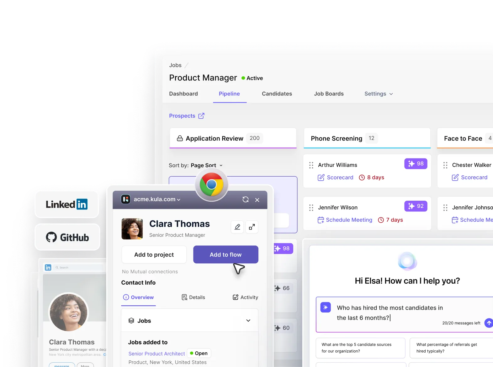
Kula: ATS with built-in dashboard for trouble-free recruitment
Kula is an all-in-one AI-powered recruitment platform with several automation features. It has been designed to provide a better experience to the recruiter, hiring manager, and candidates alike.
Of course, our ATS has all the basic analytics and reporting features but other cool features include:
- Complete recruitment process automation
- Interview intelligence (AI-powered conversational analytics)
- Candidate portal to create a better candidate experience
And that’s not all.
To ensure a seamless and trouble-free experience, our support team is always at your disposal.
Want a recruitment dashboard template that keeps you on top of your recruitment data?
Try Kula for free today!